Using responsive images and deferred stylesheets to optimize the performance of the new Pinegrow website
Pinegrow Web Editor finally has a new website that accurately represents all the features that we improved and added in the last couple of years.

It took us almost one year to finish the site, thanks to making changes on the way and catching up with the rapid pace of development of Pinegrow.
But this is not a story about why simple website projects consistently get delayed.
Instead, let’s take a look at a couple of practical examples of how we optimized the performance of the new website.
Using Lighthouse to analyze page performance
I used Lighthouse, a Chrome extension developed by Google, to analyze the performance of the website. Lighthouse is very simple to use. After the extension is installed we can click on Generate report button on any website we want to test.

Lighthouse scores the page on Performance, Progressive Web App-ness, Accessibility and SEO and lists steps for improving the score.
Accessibility and SEO are very easy to improve by basic stuff like correctly using alt attributes on images and giving descriptive names to links.
Responsive Web App stuff is not that relevant for a simple website, so I didn’t pay much attention to that.
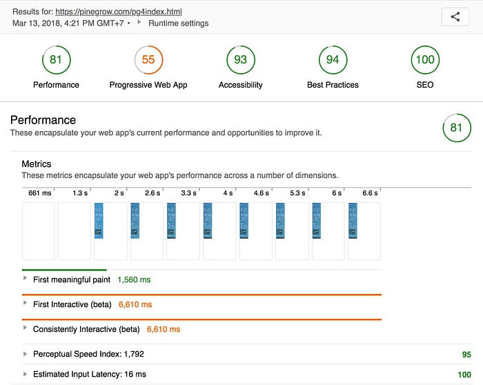
When it came to performance, the initial score was low (around 50 out of 100) with advice that major gain could be accomplished by serving correctly sized images and deferring the loading of images under the fold.
Responsive images
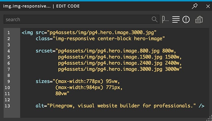
The hero image on the site is large, 3000px wide. It has to be big in order to look good on large retina screens. But, it makes no sense to download, resize and display a 3000px wide image on a mobile screen.

The good old <img> tag has a feature that is the perfect solution for that: srcset and sizes attributes.
The srcset attribute let’s us list all available images together with their natural sizes and the sizes attribute let’s us describe how big is the slot where the image is shown, at different device sizes.
At first glance this looks very complex. But it’s actually quite simple, with browser doing all the heavy lifting when using this information to choose the best image to display.
In our case we have four versions of the hero image: the original, 3000px wide, and three smaller ones, 2400px, 1500px and 800px wide.

We simply list this information in the srcset attribute without providing any judgment about which image should be used:
- pg4.hero.image.3000.jpg is 3000 natural pixels wide (we use the “w” unit for that). These are the actual pixels that we can see in Photoshop. No need to think about retina vs non-retina screens here.
- pg4.hero.image.2400.jpg is 2400w wide
- pg4.hero.image.1500.jpg is 1500w wide
- pg4.hero.image.800.jpg is 800w wide.
In srcset we separate [image] [size] items with commas.
With sizes attribute we tell the browser how big the image display will be at different window sizes, with syntax similar to media queries.
We can use Developer tools to measure the size. In our case, we list three different sizes:
- On small screens our hero image stretches almost through the full width of the page. So we say:
(max-width: 778px) 95vw. - On screens smaller than 984px the hero has fixed width of 771px,
(max-width: 984px) 771px. - On screens that are larger than that the image is about 80vw (80% of the window width) wide. We don’t list a max-width because that’s our default size. So, we just say
80vw.
Sizes are separated with commas again.
For our hero image we get this code (repeating the image from above). And now it makes more sense, right?
We can use “px”, “rem”, “%”, “vw” or any other CSS unit to describe the image size here. Again, just like with srcset, we don’t have to think about matching image versions with different slot sizes. We just provide the information and the browser will do all the unit conversions and calculations to choose the right image.
Most modern browsers support srcset and sizes attributes. And those that don’t will just ignore that and display the image specified in the src attribute. The safest approach is to list the medium sized image in the src attribute.
There’s a lot more to responsive images. This is just an example of how they can be used in practice.
This was the first time I used responsive images on a production website. The approach is very powerful, but the implementation is begging for automation. It would be great to have a helper tool in Pinegrow that would take care of setting up the correct image sets and sizes. We’ll work on that.
Using deferred stylesheets to load images without blocking the page
Normally the browser will load all images (and other resources) before making the page fully interactive. That increases the time during which the user feels that the page is loading.
In our case we have seven large images in the Features section as posters for each individual feature. These images are displayed under the fold, so it makes sense to load them after the main page is loaded.

I’m not a fan of using too much Javascript on the page. Also, we want to use responsive images in order to serve the correctly sized images.
We have three image sizes for each feature poster: 1920px , 1280px and 640px wide.
Although we could use the same responsive images approach that was described above for the hero image, we already had responsive behavior done with the help of CSS media queries and background images.
For example, for the HTML editing feature:
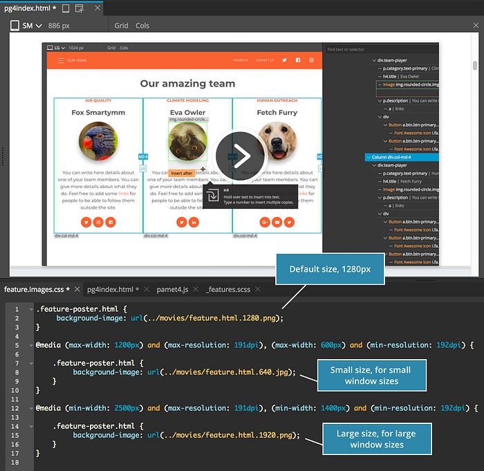
No need to change something that already works.
Instead, I placed these CSS rules in a separate stylesheet that is loaded dynamically, after the page is loaded.
The safe approach to do that is described on Google’s Page speed tools.
We wrap the stylesheet reference in a <noscript> tag so that the styles are loaded even if Javascript is disabled.

And in the likely case that Javascript is available, we run the code that takes the content of this <noscript> tag and inserts it on the page, triggering loading of the stylesheet. That in turn loads and displays our images, using media queries to select the right image size.
If I would be making this website again, I would probably choose to implement these images as normal <img> tags with srcset and sizes attributes.
But using deferred stylesheets is a handy approach to have in our tool-belt. It’s useful in other situations as well. For example, we can us it to load styles that are not needed for the initial page display.
The result
Using responsive images for the hero image and loading feature posters with a deferred stylesheet increased our performance score to 81 and significantly decreased the perceived loading time.
The trick with optimizations is knowing when to stop.
We could continue optimizing the page and shaving off a couple of milliseconds here and there, but at the moment, the website works good enough.
Perhaps all of this sounds very basic. But surprisingly, running the test on a set of random sites reveals that many websites are not taking advantage of these easy opportunities for improving the browsing experience.
Doing that is an easy way to stand out from the crowd.
